- Introduction
- 1. React Native Internals 📡
- 2. Setting up the project 🌈
- 3. See it in action! 🎬
- 4. Project Structure 🏢
- 5. Conventions and Code Style 🎓
- 6. Testing and Debugging 🚫🐞
- 7. Styling 💅🏻
- 8. Redux 🗄
- 9. Navigation 🚪
- 10. DevOps ⚙️
- 11. SVG Icons using react-native-vector-icons 🐾
- 12. Internationalization 🇮🇳🇺🇸🇷🇺
- 13. Custom Native Modules 🍮
- 14. References
- 15. The End
- Published with GitBook
Theme Variables
In general, every app should have well defined font sizes, colors, spacing, etc. This is done so that the app looks consistent across screens. Now this can be achieved by maintaining a convention across the app. For example, the devs and UX designers can decide fontSize as:
- 16 - Large
- 14 - Medium
- 12 - Small
Hence our stylesheet may look like this:
styles.js
import { StyleSheet } from 'react-native';
export default StyleSheet.create({
  largeButtonText: {
    fontSize: 16,
    fontWeight: 'bold'
  },
  largeHeaderText:{
    fontSize: 16
  },
  mediumHeaderText: {
    fontSize: 14,
    color:'blue'
  }
});
Even though this convention is good and will help you maintain consistency in small, medium and large text sizes across the app, it does have a few fundamental flaws:
Business/marketing team may come up with a change in the requirement that the large font size needs to be 18 instead of 16.
Now as a developer, you will need to make changes in the entire app and replace every instance of fontSize:16 with fontSize:18, which kind of sucks!.
- A new developer who joins the team might not be aware of all the conventions followed by the team and may create a component with fontSize other than 12, 14 or 16, thus accidentaly overlooking the code standard/convention.
Enter theme variables.
In order to solve the above-mentioned issues, we introduce a common file theme.style.js which will be located at app/styles/theme.style.js.
In the theme file we define our theme variables as follows:
app/styles/theme.style.js
export default {
  FONT_SIZE_SMALL: 12,
  FONT_SIZE_MEDIUM: 14,
  FONT_SIZE_LARGE: 16,
  PRIMARY_COLOR: 'rgb(30, 147, 242)',
  SECONDARY_COLOR: 'rgb(238, 167, 2)',
  FONT_WEIGHT_LIGHT: 200,
  FONT_WEIGHT_MEDIUM: 600,
  FONT_WEIGHT_HEAVY: 800
};
and we can use them like this:
styles.js
import { StyleSheet } from 'react-native';
import theme from '../styles/theme.style.js';

export default StyleSheet.create({
  largeButtonText: {
    fontSize: theme.FONT_SIZE_LARGE,
    fontWeight: theme.FONT_WEIGHT_HEAVY
  },
  largeHeaderText:{
    fontSize: theme.FONT_SIZE_LARGE
  },
  mediumHeaderText: {
    fontSize: theme.FONT_SIZE_MEDIUM,
    color:theme.PRIMARY_COLOR
  }
});
Now our theme file dictates the size of fonts and the primary color, etc.
This gives us two benefits:
- If our business team now tell us to change the font sizes, we can change the theme variables at one place and it gets reflected in the entire app.
- This will enable us to write multiple theme files which in turn adds basic theming support to our app. For example we can write two theme files - one for a light theme and one for a dark theme and give our app users the option to switch between the themes.
Integrating theme variables into our NoteTaker demo
Enough of theory. Let's try and inculcate this concept into our demo app.
First of all, add the file app/style/theme.style.js.
app/style/theme.style.js
export default {
  PRIMARY_COLOR: '#2aabb8',
  FONT_SIZE_SMALL: 12,
  FONT_SIZE_MEDIUM: 14,
  FONT_SIZE_LARGE: 16,
  FONT_WEIGHT_LIGHT: '200',
  FONT_WEIGHT_MEDIUM: '500',
  FONT_WEIGHT_BOLD: '700',
  BACKGROUND_COLOR_LIGHT: '#f0f6f7',
  CONTAINER_PADDING: 20
};
Now we need to modify our components to use the theme variables.
Modify the following files:
app/components/TextArea/TextArea.component.style.js
import {StyleSheet} from 'react-native';
import theme from '../../styles/theme.style';

export default StyleSheet.create({
  textArea: {
    fontSize: theme.FONT_SIZE_MEDIUM,
    fontWeight: theme.FONT_WEIGHT_LIGHT
  }
});
app/components/Home/Home.component.js
import React, {Component} from 'react';
import {View, Text} from 'react-native';
import styles from './Home.component.style';
import TextArea from '../TextArea/TextArea.component';

class Home extends Component {
  render () {
    return (
      <View style={styles.container}>
        <Text style={styles.textAreaTitle}> Please enter your note here</Text>
        <TextArea style={styles.textArea}/>
      </View>
    );
  }
}

export default Home;
app/components/Home/Home.component.style.js
import {StyleSheet} from 'react-native';
import theme from '../../styles/theme.style';

export default StyleSheet.create({
  container: {
    flex: 1,
    paddingVertical: theme.CONTAINER_PADDING,
    alignItems: 'center'
  },
  textAreaTitle: {
    fontSize: theme.FONT_SIZE_MEDIUM,
    fontWeight: theme.FONT_WEIGHT_BOLD,
    alignSelf: 'flex-start',
    padding: 10
  },
  textArea: {
    flex: 1,
    padding: theme.CONTAINER_PADDING,
    alignSelf: 'stretch',
    overflow: 'scroll',
    backgroundColor: theme.BACKGROUND_COLOR_LIGHT
  }
});
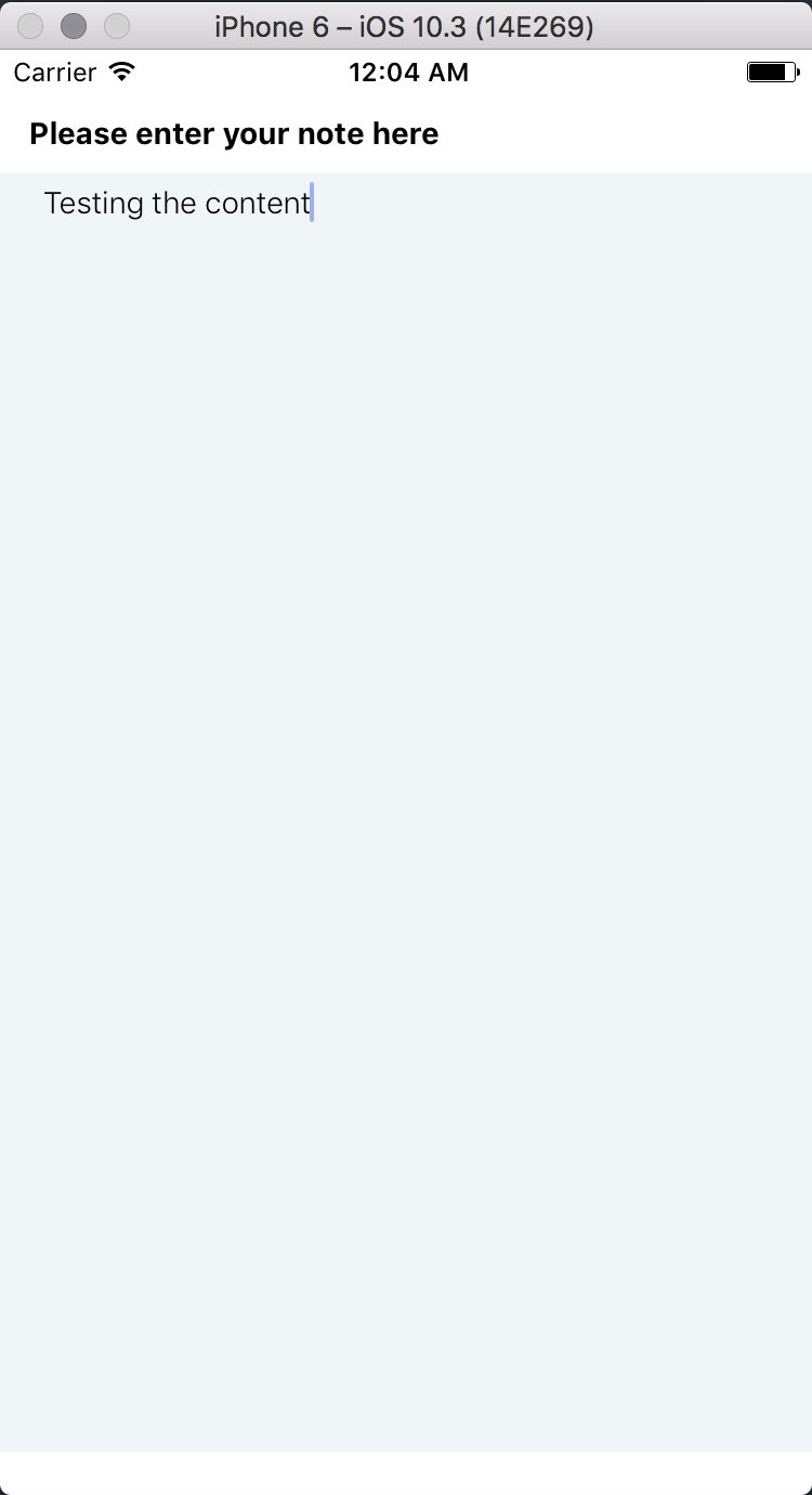
Our app should now look like this:

The code till here can be found on the branch chapter/8/8.1