- Introduction
- 1. React Native Internals 📡
- 2. Setting up the project 🌈
- 3. See it in action! 🎬
- 4. Project Structure 🏢
- 5. Conventions and Code Style 🎓
- 6. Testing and Debugging 🚫🐞
- 7. Styling 💅🏻
- 8. Redux 🗄
- 9. Navigation 🚪
- 10. DevOps ⚙️
- 11. SVG Icons using react-native-vector-icons 🐾
- 12. Internationalization 🇮🇳🇺🇸🇷🇺
- 13. Custom Native Modules 🍮
- 14. References
- 15. The End
- Published with GitBook
Common styles
In React Native, each component is styled using inline styles. This means that it becomes slightly tricky to share styles as you can in web.
In web, we write a class
.btn {
  padding: 10;
  border: '1px solid black';
}
Now if we want to apply this class to two different divs we will do so as follows:
<div class='btn first-btn'>First button</div>
<div class='btn second-btn'>Second button</div>
The same is possible in React Native in the following way:
styles.js
import { StyleSheet } from 'react-native';
export default StyleSheet.create({
  btn: {
    padding: 10,
    borderWidth: 1
  },
  firstBtn:{
    ...
    ...
  },
  secondBtn:{
    ...
    ...
  }
});
and we will add styles to our View by:
import styles from './styles.js';
...
...
...
<View>
  <View style={[styles.btn, styles.firstBtn]}>First button</View>
  <View style={[styles.btn, styles.secondBtn]}>Second button</View>
</View>
This solves the problem only if the style objects are in the same component because in RN we do not import styles from other components (each component has its own style). But in web, we could have just reused the class anywhere (since css is global).
To solve the problem of reusable styles in React Native, we introduce another file named app/style/common.style.js
This is where we will write our mixins/common styles.
Hence, if all the buttons in our app have a similar style we can write a style with similar properties inside the common.style.js
app/style/common.style.js
import { StyleSheet } from 'react-native';
export default StyleSheet.create({
  btn: {
    padding: 10,
    borderWidth: 1
  }
});
And we can just import this in our component style files and reuse them directly like this:
styles.js
import { StyleSheet } from 'react-native';
import common from '../style/common.style.js';
export default StyleSheet.create({
  firstBtn:{
    ...common.btn,
    backgroundColor: 'blue'
  },
  secondBtn:{
    ...common.btn,
    backgroundColor: 'red'
  }
});
and we will add styles to our View like this:
import styles from './styles.js';
...
...
...
<View>
  <View style={styles.firstBtn}>First button</View>
  <View style={styles.secondBtn}>Second button</View>
</View>
This way our mixins/common style file will provide us the base styles which are common across the app and we write component specific styles in the component style file. This allows significant style reuse and avoids code duplication.
Integrating common/mixin styles into our NoteTaker demo
Before we go into common styles, let's modify our code a bit to add another component for entering a title for our note. Modify the files as follows:
app/components/Home/Home.component.js
import React, {Component} from 'react';
import {View, Text, TextInput} from 'react-native';
import styles from './Home.component.style';
import TextArea from '../TextArea/TextArea.component';

class Home extends Component {
  state = {
    title: '' // adding the state here temporarily for illustration purposes
  }
  setTitle = (title) => this.setState({title})
  render () {
    return (
      <View style={styles.container}>
        <Text style={styles.titleHeading}> Note Title</Text>
        <TextInput style={styles.titleTextInput}
            onChangeText={this.setTitle} value={this.state.title} />
        <Text style={styles.textAreaTitle}> Please type your note below </Text>
        <TextArea style={styles.textArea}/>
      </View>
    );
  }
}

export default Home;
app/components/Home/Home.component.style.js
import {StyleSheet} from 'react-native';
import theme from '../../styles/theme.style';

export default StyleSheet.create({
  container: {
    flex: 1,
    paddingVertical: theme.CONTAINER_PADDING,
    alignItems: 'center'
  },
  titleHeading: {
    fontSize: theme.FONT_SIZE_MEDIUM,
    alignSelf: 'flex-start',
    padding: 10,
    fontWeight: theme.FONT_WEIGHT_BOLD,
  },
  titleTextInput: {
    padding: theme.TEXT_INPUT_PADDING,
    backgroundColor: theme.BACKGROUND_COLOR_LIGHT,
    alignSelf: 'stretch'
  },
  textAreaTitle: {
    fontSize: theme.FONT_SIZE_MEDIUM,
    alignSelf: 'flex-start',
    padding: 10,
    fontWeight: theme.FONT_WEIGHT_LIGHT,
    fontStyle: 'italic'
  },
  textArea: {
    padding: theme.TEXT_INPUT_PADDING,
    backgroundColor: theme.BACKGROUND_COLOR_LIGHT,
    alignSelf: 'stretch',
    flex: 1
  }
});
app/styles/theme.style.js
export default {
  PRIMARY_COLOR: '#2aabb8',
  FONT_SIZE_SMALL: 12,
  FONT_SIZE_MEDIUM: 14,
  FONT_SIZE_LARGE: 16,
  FONT_WEIGHT_LIGHT: '200',
  FONT_WEIGHT_MEDIUM: '500',
  FONT_WEIGHT_BOLD: '700',
  BACKGROUND_COLOR_LIGHT: '#f0f6f7',
  CONTAINER_PADDING: 20,
  TEXT_INPUT_PADDING: 10
};
Our app should now look like this:
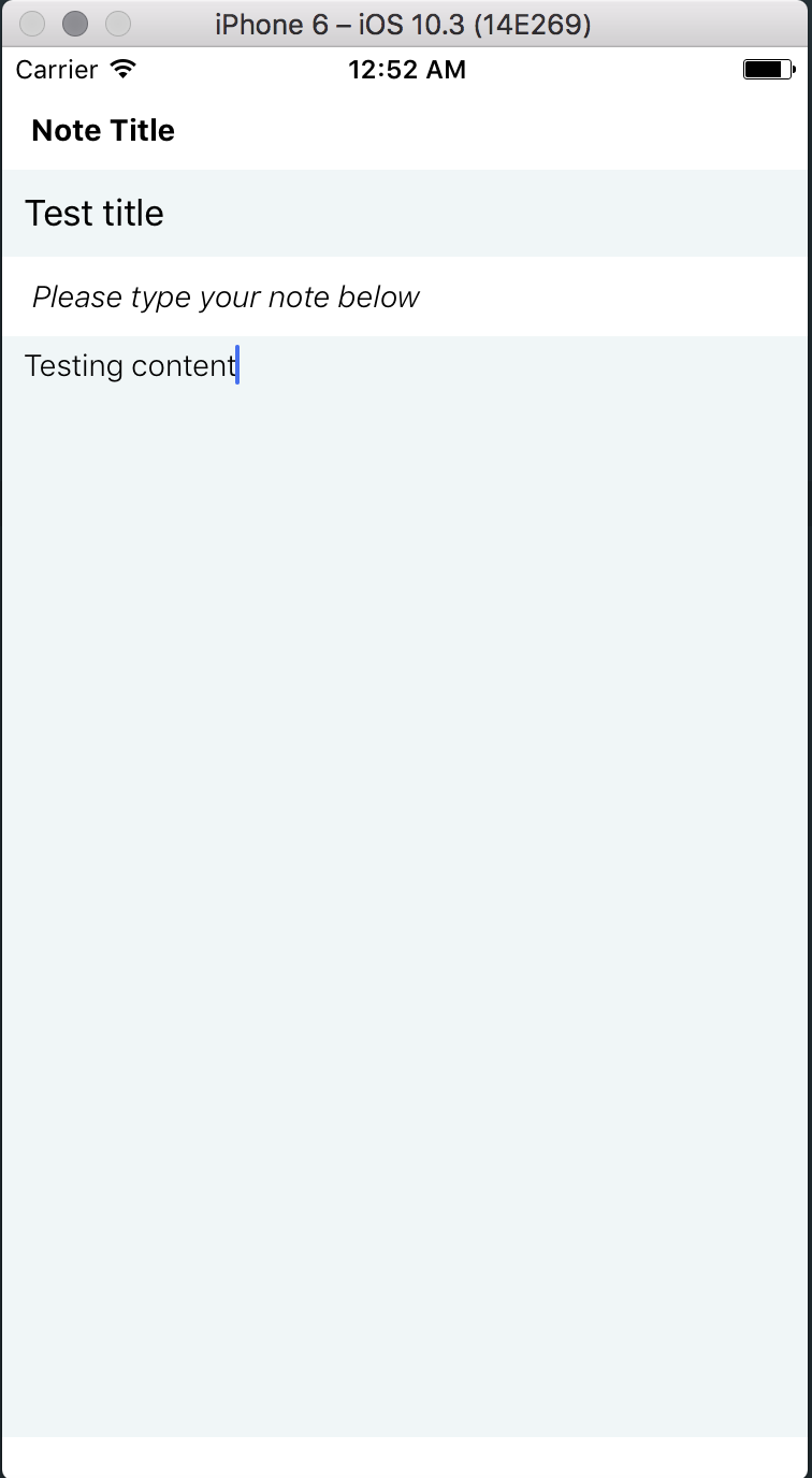
If you notice, even though we have a theme file, our style code has a lot of duplicated code. This is primarily because we are repeating our styling for text input and also for the heading.
The solution to this problem, as discussed before, is common styles/mixins.
Let's create the file common.style.js
app/styles/common.style.js
import theme from './theme.style';

export const headingText = {
  fontSize: theme.FONT_SIZE_MEDIUM,
  alignSelf: 'flex-start',
  padding: 10,
  fontWeight: theme.FONT_WEIGHT_BOLD,
};

export const textInput = {
  padding: theme.TEXT_INPUT_PADDING,
  backgroundColor: theme.BACKGROUND_COLOR_LIGHT,
  alignSelf: 'stretch'
};
And modify our component style files to include the common.style.js
app/components/Home/Home.component.style.js
import {StyleSheet} from 'react-native';
import theme from '../../styles/theme.style';
import {headingText, textInput} from '../../styles/common.style';

export default StyleSheet.create({
  container: {
    flex: 1,
    paddingVertical: theme.CONTAINER_PADDING,
    alignItems: 'center'
  },
  titleHeading: {
    ...headingText
  },
  titleTextInput: {
    ...textInput
  },
  textAreaTitle: {
    ...headingText,
    fontWeight: theme.FONT_WEIGHT_LIGHT,
    fontStyle: 'italic'
  },
  textArea: {
    ...textInput,
    flex: 1
  }
});
If you see our style code looks much more concise and we are resuing the styles for similar components with slight style changes. Hence, we import our base styles for the components from common.style.js and add our custom styles later on top of it. This way we reduce our work and minimize code duplication.
We see no change in the output but our code becomes much cleaner.

The code till here can be found on the branch chapter/8/8.2